
The Challenge
Adapting Wixel's desktop-first AI tools for mobile — balancing high typing friction and tight screen space with credit-based economics.
My Role
Partnered with a PM to define requirements and owned the end-to-end design for Remove Background and Replace/Generate Background.
Overview
Wixel (by Wix) is an AI-first image platform. Following its May 2025 desktop launch, the objective was to build native mobile apps for on-the-go e-commerce sellers and digital creators - shipping on Android (July 2025) and iOS (October 2025). Without live mobile analytics at launch, design decisions relied on internal dogfooding, desktop data, and public competitor patterns.
KPIs [ Targets ]
Activation
50%
Registration Rate upon download
Conversion
1.5%
Upgrade Rate to Premium
Engagement
5,000+
AI Credits consumed in Q1
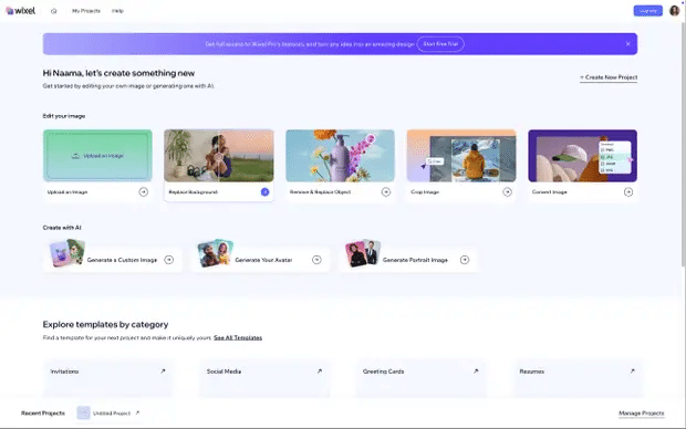





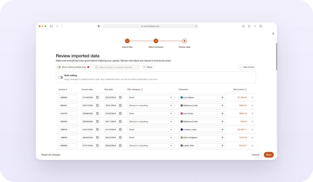
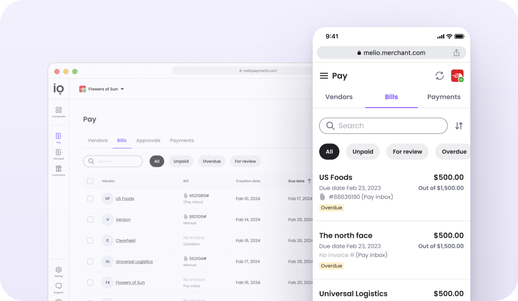
The desktop feature as it ran during the sprint — product screenshots, June 2025. This is what Act 2 had to translate to a thumb.
Desktop screenshots
Click any screen to enlarge.
A phone is not a small desktop
01
Input is expensive
Typing complex, highly descriptive AI prompts on a mobile keyboard is the highest-friction action a mobile user can take.
02
Screen budget is tiny
Persistent desktop sidebars, layers, and floating tool panels cannot scale down. Every single pixel on a mobile viewport must earn its place.
03
Interruptions are the norm
Long AI generation times are tolerated on desktop, but on mobile, they trigger immediate drop-offs and split attention.
04
Money works differently
Users expect native patterns: trials, plan pickers, store billing.
And underneath all four: a credit is consumed on every generation, whether or not the user keeps the result. At Picsart — the closest credit-based competitor — hidden credit costs are the top documented complaint (Trustpilot: a "complete subscription trap").
In credit-based editors, the most documented complaint isn't output quality — it's hidden costs.
Sprint framing
What the sprint ran on
A brand-new product means no analytics and no research archive. The sprint's knowledge base was assembled instead from three honest sources: confirmed product facts, cited competitor evidence, and how the mobile field already solves these problems:
•
Cost is visible before any credit-consuming action — at the decision moment.
•
No AI result applies to the canvas without explicit acceptance.
•
Failure never dead-ends; recovery costs one tap.
•
A genuinely usable credit-free path lives beside the paid one.
•
Paywall timing was the design decision, not content.
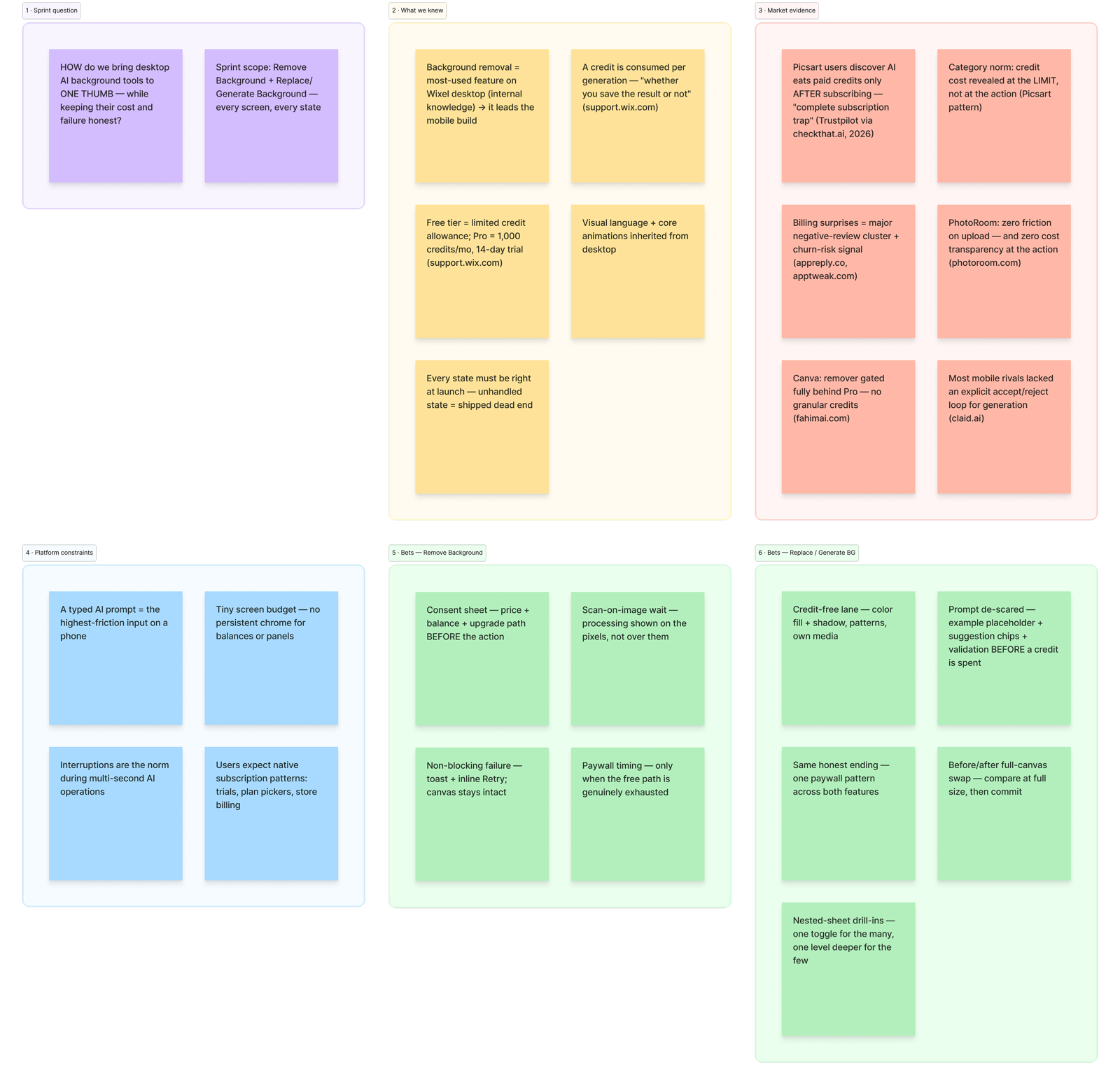








Field references, via Mobbin — Riveo (credits in a sheet at the AI action), Picsart (prompt chips), Photoroom (teaching placeholders), Shopee & Unfold (one-tap removal and result states), Finimize (trial paywall), Instagram (editing sheet and its Adjust drill-in — the nested pattern), Lensa AI (retouch sliders).
Field references, via Mobbin
Act 1 · Remove Background
A fast, one-tap AI action focused on high conversion and instant utility.
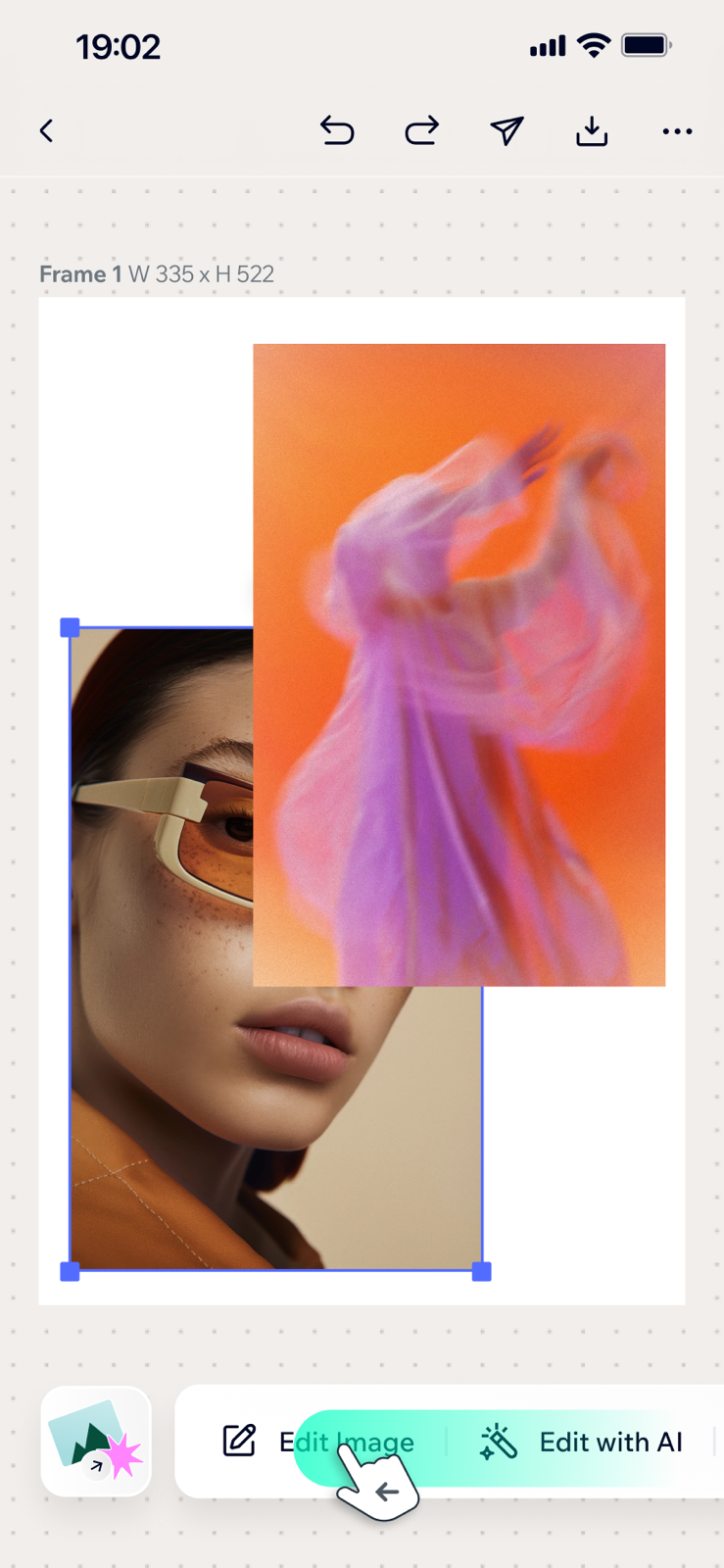
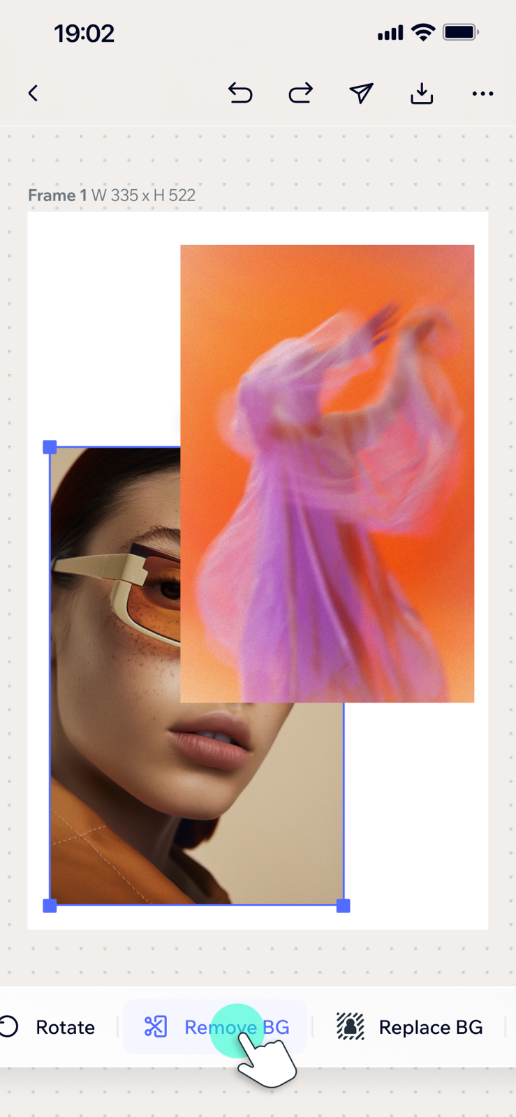
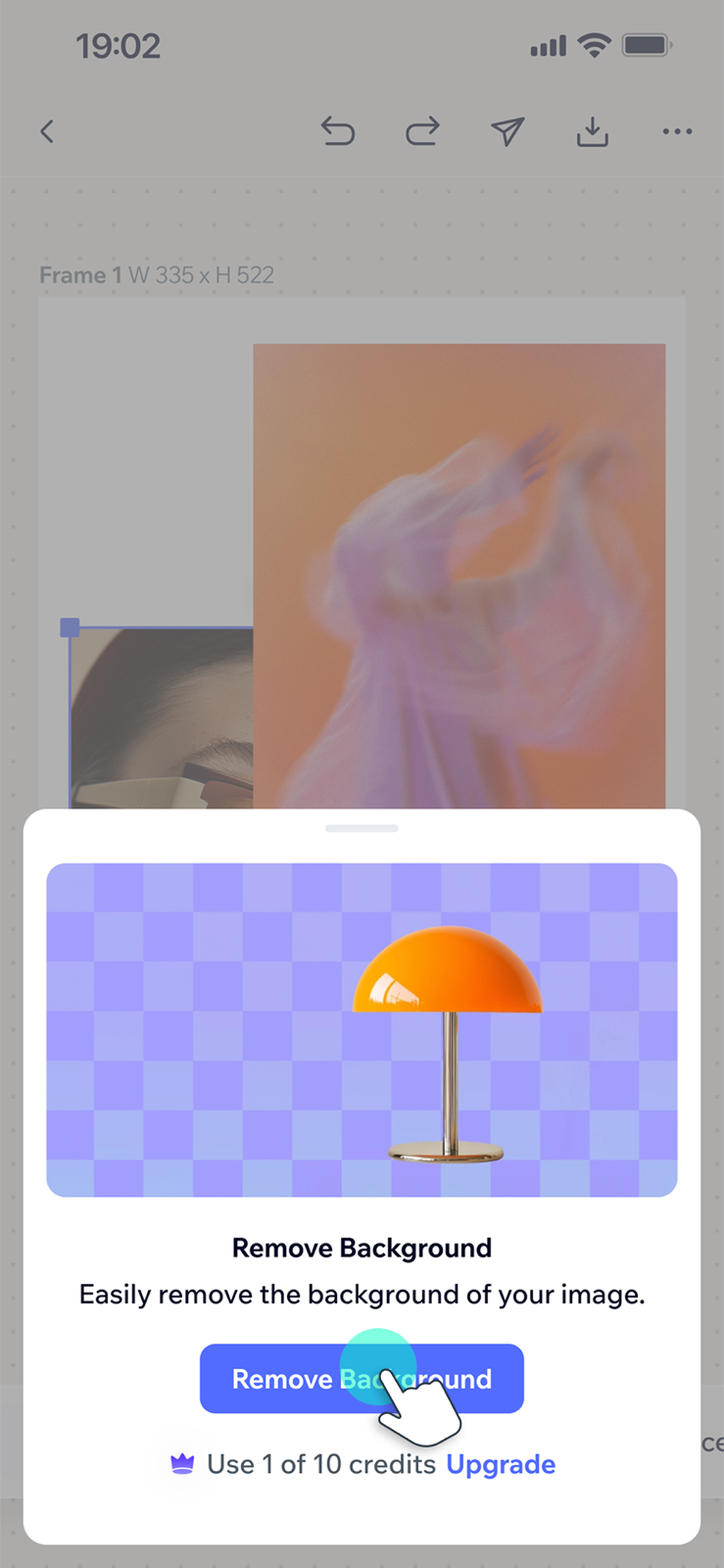
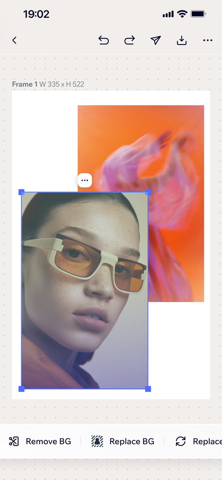

Remove Background — the whole flow: three steps and two branches, failure and out-of-credits.
Remove Background Flow
Click any screen to enlarge.
A short flow; the design is in the consent.
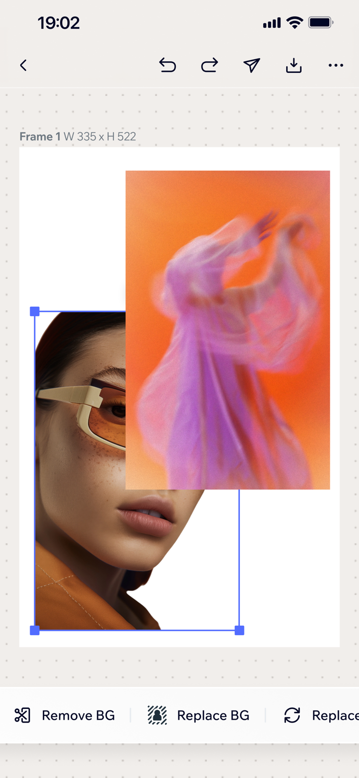
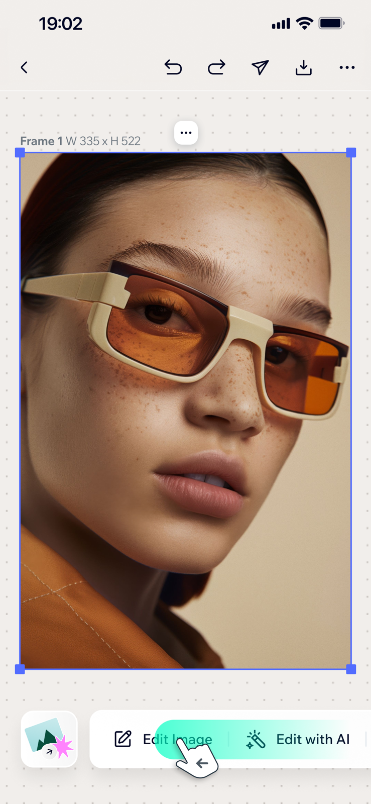
"Remove BG" doesn't fire on tap — it opens a bottom sheet first: preview, CTA, and "Use 1 of 10 credits · Upgrade" in one visual group. The image then lifts to the top layer, a scanning animation carries the wait, and the background is gone. On failure, a toast with inline Retry — no modal, canvas intact. The paywall appears only when credits are actually exhausted.
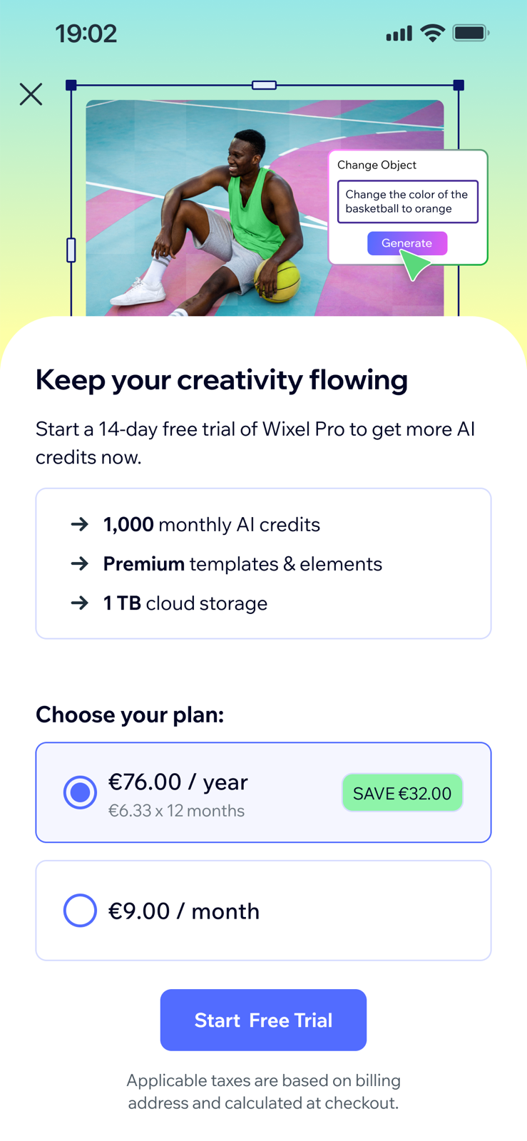
The consent sheet, and its out-of-credits variant.
Click to enlarge.
Act 2 · Replace / Generate Background
A generative tool that restages the object — from a text prompt, or from credit-free colors, patterns and media.
Prompt input: Visual prompt first, typing optional.
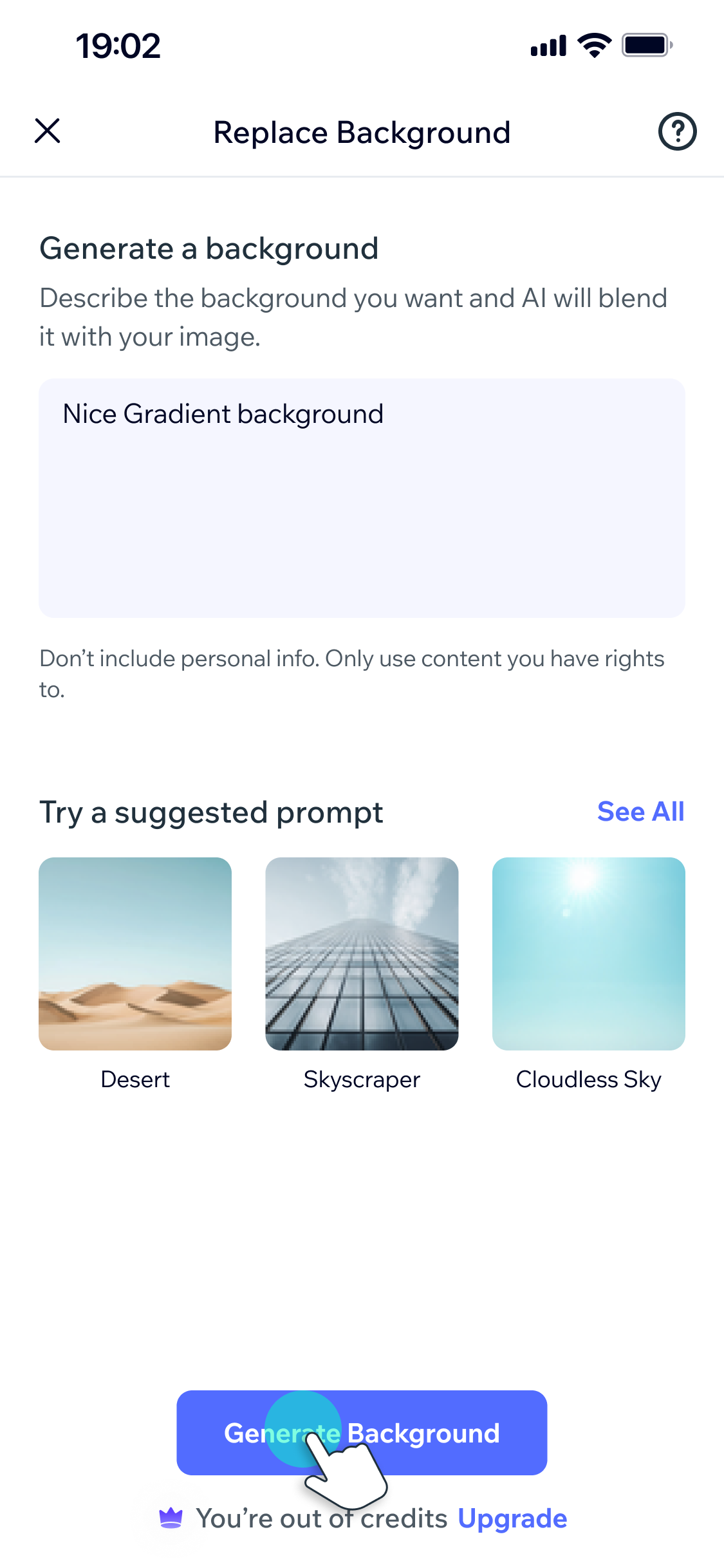
Desktop relied on an always-open side panel for prompts, and drawers. On mobile, this translated into a dynamic bottom-sheet and modal system with internal drill-in navigation for the more complex flows, designed specifically to reduce mobile typing friction.
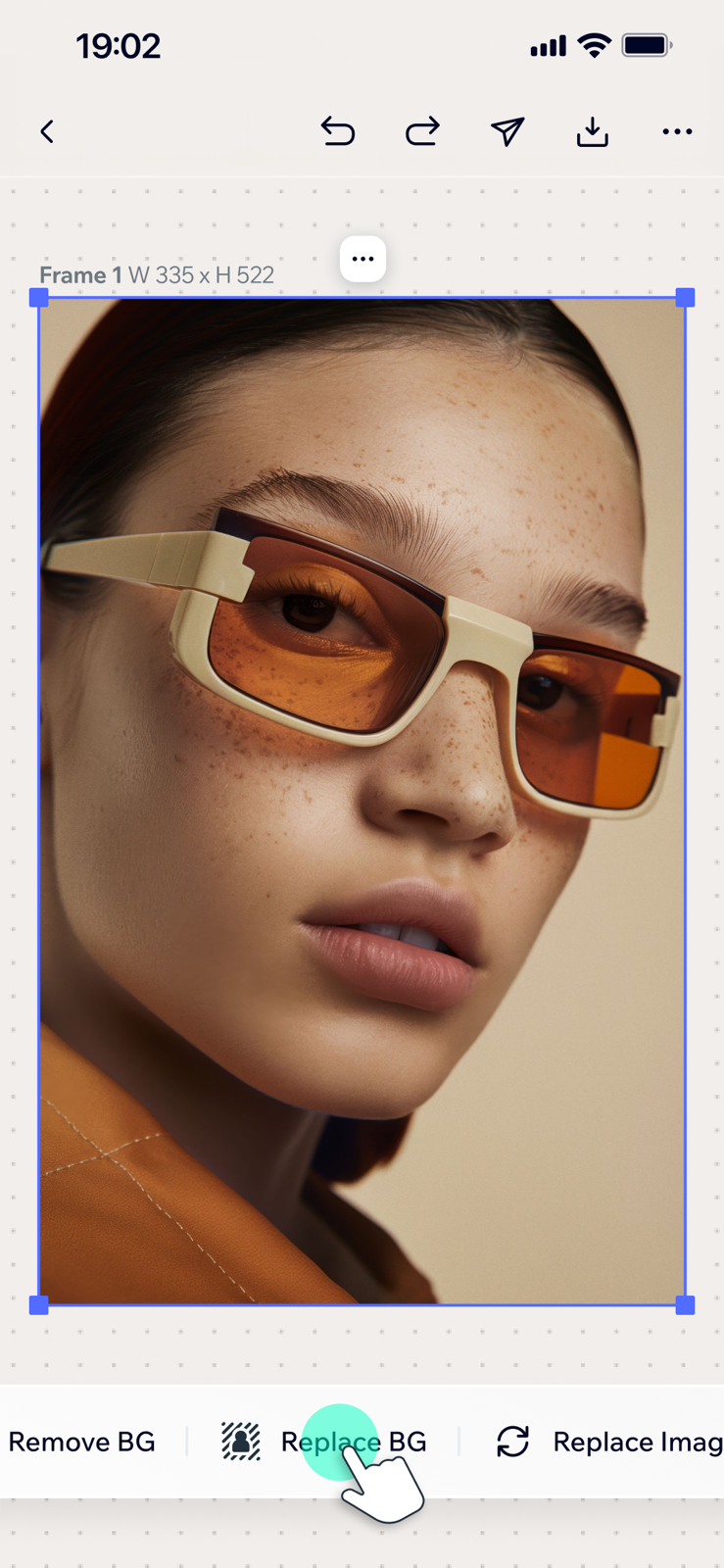
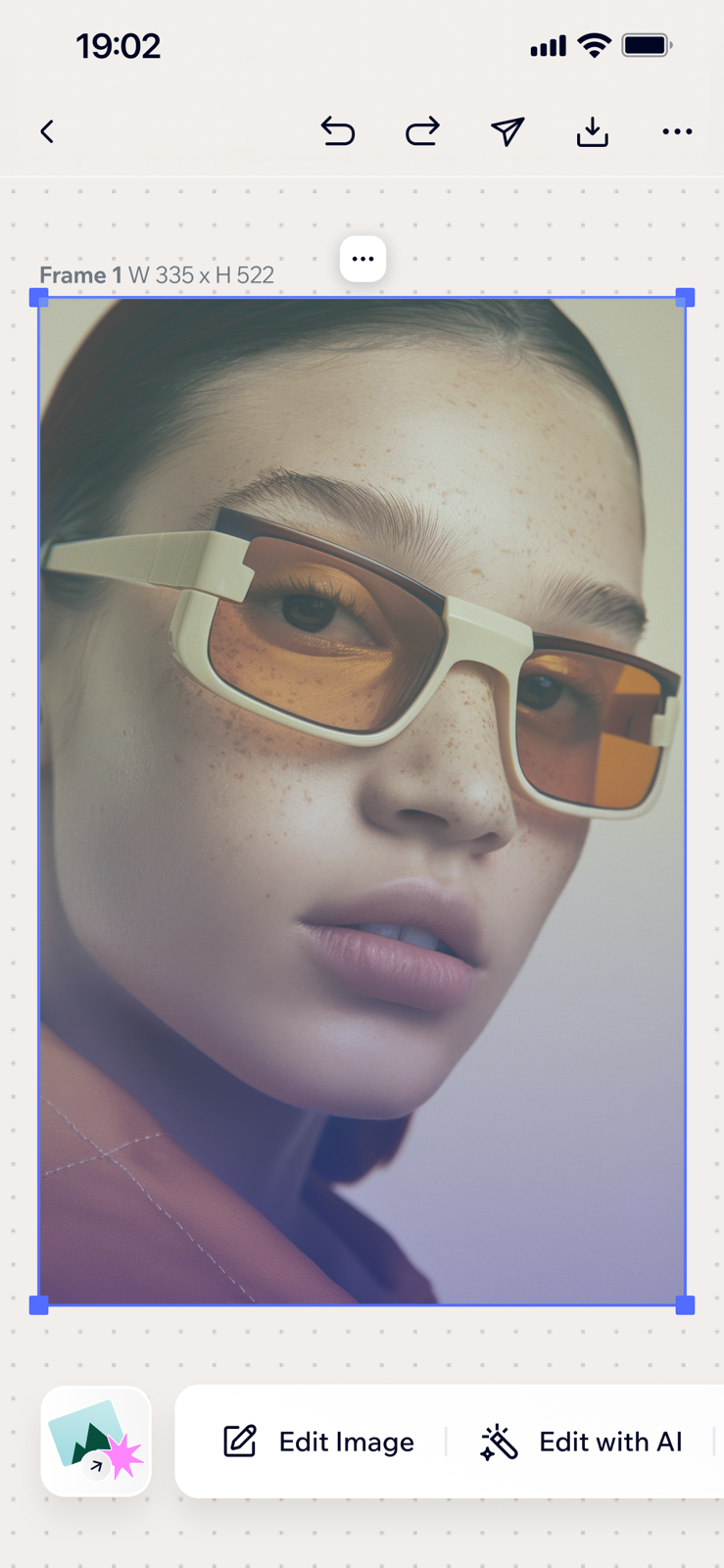

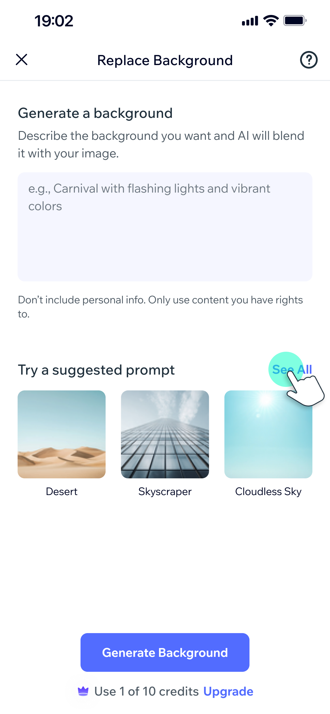
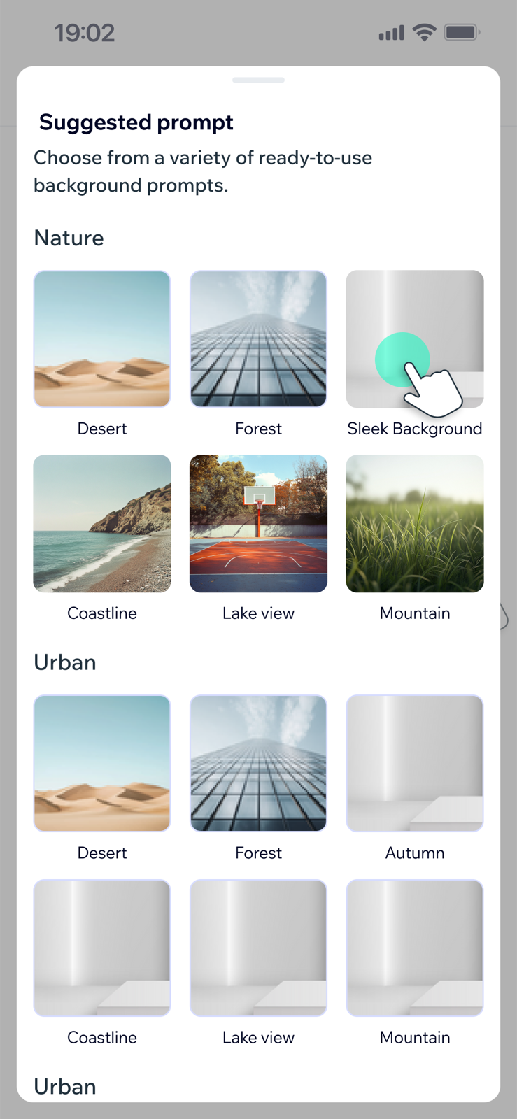
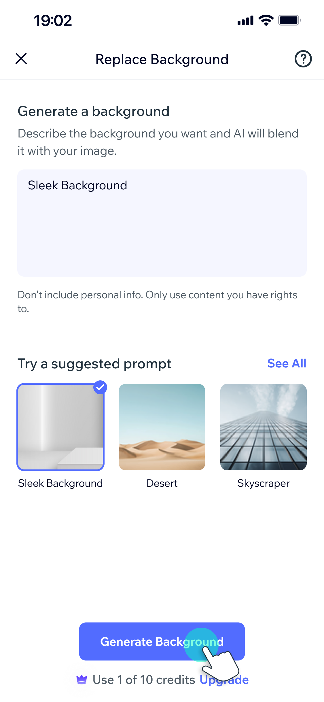

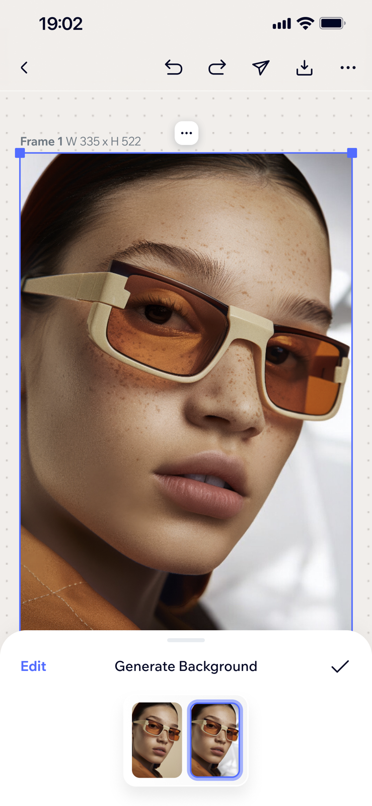
Generate Background — the flow at a glance: describe, review, accept — Generations don't overwrite the canvas instantly. A distinct review state with Accept Changes vs. Edit Prompt loop keeps the human in control.
Generate Background Flow
Click any screen to enlarge.
Providing a 'Free Lane' Next to the AI Lane
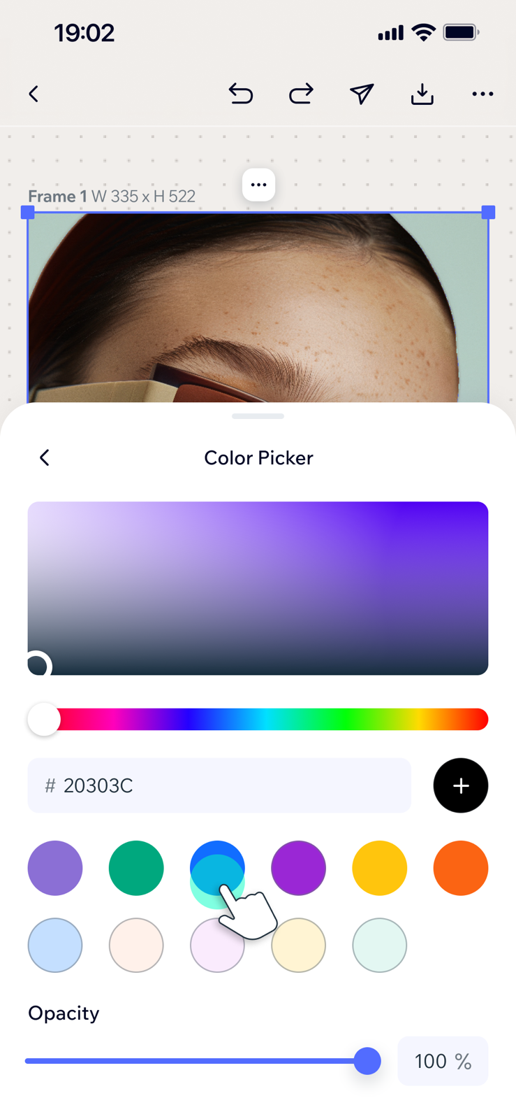
Credit-free alternatives — Color Fills with a mobile-optimized picker and an "Apply Shadow" toggle, Pattern Grids with pre-curated patterns, and the user's own media.




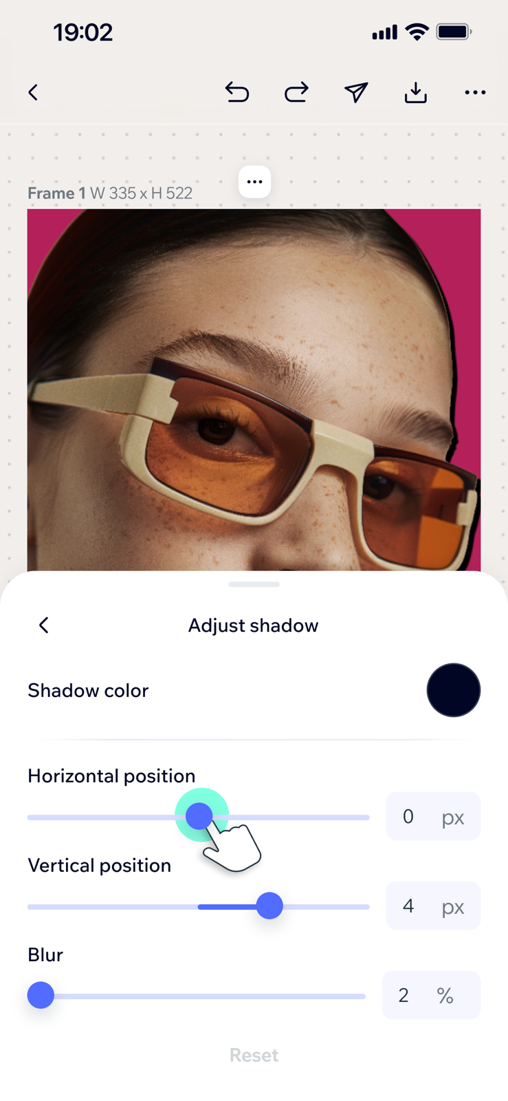
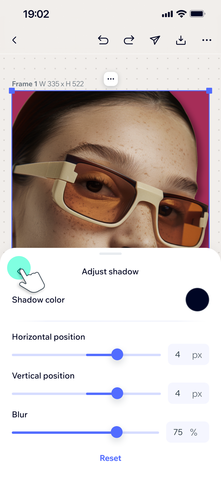


Replace Background — a credit-free flow at a glance: select, adjust, review, accept
Click any screen to enlarge.
A tap for the common case, a drill-in for control.
Apply Shadow makes credit-free color fills look natural with one switch; a full editor (color, position, blur) waits behind a chevron. Both run on a nested-sheet navigation I designed — a child sheet over the parent, back chevron, never leaving the canvas — reused for the pattern grid and the color picker.
Suggested prompts
Adjust shadow

Choose background - Add color

Choose background - Patterns


One pattern, three drill-ins — always one level deep, same way back.
Click any screen to enlarge.
What a five-tap flow really takes
The happy path is five taps; the work is everything around it — consent, processing, failure and recovery, validation, review, out-of-credits, paywall, and the free lanes. On a 0→1 build, an unhandled state ships as a dead end.
64
Screens across two flows
2
Flows, one shared system
6
State classes
~2
Weeks of design sprint
Desktop vs. Mobile UX Mapping:
What Changed?
Desktop Pattern
Mobile Adaptation
Always-open side panel next to the canvas
Contextual bottom sheets — appear on intent, the canvas stays visible
Credit balance lives in top-bar chrome
No persistent balance — cost surfaces at the decision moment, in the sheet
Fine control in pop-overs (Adjust Shadow sliders, Suggested Prompts drawer)
One smart toggle; fine control one nested drill-in deeper, same way back
Upgrade lives in persistent chrome; checkout on the web
Native trial paywall — reachable anytime via Upgrade, interrupts only at credit exhaustion
Reflection
Based on the measurement plan above, if I owned the next product cycle of Wixel Mobile, the first three areas I would prioritize for testing are:
•
Does the consent sheet's credit line lift upgrades - or abandonment?
•
Do prompt chips cannibalize written prompts, and does it matter?
•
After a paid failure - do users retry, edit, or leave?